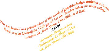
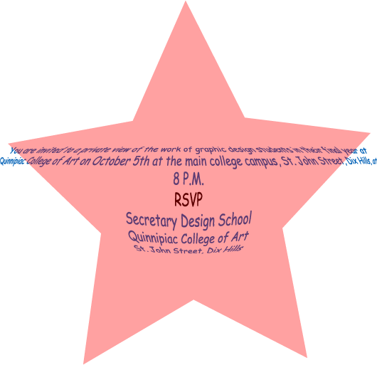
Friday, July 14, 2006

Minor Project 16:

For my Major Project 5, I have decided to use the booklet template, but it is not a definite decision yet. The look and feel will be relaxing and nothing too "out there". I think I am going to do it in a timely fashion and not overload on the ideas for it. The type will probably be larger than normal with a unique style of font. Overall, my MP5 will be simple yet solid.
Minor Project 15:

When I first opened the Graphic Design School book, I was amazed at all of the information I had not known. I never realized how much work it takes to make a picture unique from an ordinary blotch on a piece of paper. The techniques used to draw attention to one part of the picture interested me very much. I especially love the near/far technique because it challenges your mind and eyes while you become amazed with the image. Along with this, the differences in colors such as the hue and saturation came new to me as well. The meanings of each different color in other parts of the country made me think of what other customs are completely different to us and in other countries. All of this information was pretty much a new world of design for me. The section on text techniques was very interesting and significant to me because now I understand and am able to make a plain, simple text layout into a visual and readable masterpiece. There are so many design techniques that I have never even knew existed. However, along with this information from the book and the information and examples from the other Adobe design books, I hope to learn and become even more fascinated with Interactive Digital Design than I originally had.

Monday, July 10, 2006

Major Project 4:

Sunday, July 09, 2006

Minor Project 13:

For my MP4, I have chosen to do a one page spread, possibly 2-page spread, of an article from espn.com. This article will involve the finale to the world cup and Italy's victory. The target audience will most likely be soccer fans, or sports fans in general. The theme will be teamwork and victory obviously. I will have 2 columns of text with pictures inside of the text to show what had happened at the world cup.

Friday, July 07, 2006

Minor Project 12:

Part 1:

What I first found to be significant and important is within the discussion on formats. I agree that when starting to develop ideas, the first idea to keep in mind is to stay away from the computer. Once you start up on the computer, you might miss certain steps to start the project. What was new to me was the term USP-a unique selling proposition. This sounds like it is a distinct characteristic of quality that is different from all other ads.

Friday, June 30, 2006

Minor Project 10:

For my Major Project 3, I think I will use my father's business, DRS, which stands for Debt Recovery Solutions. I have been working there this summer and feel that the company's logo could use some help. What I will definitely need in the logo design is an object that stands for what DRS actaully does. I think I will also use some sort of money symbol, probably a standard one and mess with it later on. I want this logo to make DRS stand out and let everyone know what DRS means
Minor Project 9:

Part 1:

What I found to be very interesting was the fact that some fonts that we use today have been around ever since the 16th century. Some of us today consider these fonts as just certain style to make something look cool, but back then, these fonts meant something. To me, that is fascinating. What I had also found to be interesting, new, and significant all in one was the idea of leading. Up to now, I have not heard of the term leading in designing terms. I have a feeling that leading will become significant in the future during text designing in future projects. The thought that designers can exploit the aspect of letter forming by "carefully manipulating suggestive letter forms so that they become images in their own right" interests me a lot. I love trying to figure out what certain words mean, but at the same time what they are trying to make out as an image.

Part 2:


Monday, June 26, 2006

Major Project 2:


I chose to do a poster design for the movie "The Shining" by Stanley Kubrick. I chose this movie poster because I felt like I had a lot to work with. Being that it is a horror flick, I would be able mess around with dark colors and blending and transforming objects to fit the scene of the picture. The infamous axe scene in the movie will definitely be used in my poster design along with the notorious "REDRUM".


RedRum - http://mercury.walagata.com/w/the-salamander/REDRUM.jpg

Axe - http://surf4you.free.fr/Images/affiches_cin%E9/Shining.jpg

Background - http://blogs.indiewire.com/twhalliii/shining.jpg

Thursday, June 22, 2006

Minor Project 6

Part 1:

What I found to be interesting throughout pages 40-77 was that if "there is unevenness in the letter spacing the eye can easily become distracted by the space rather than seeing the shapes." Why I thought this was interesting was because I never really knew that something so minor can create such a distraction to the viewer. What I had found to be significant in my readings was the good point brought across about increasing type size so that it will attract the reader's attention. Obviously the human eye catches the bigger part of the picture first and then is able to see the rest, but I think this statement will become necessary and handy for the future.

Part 2: