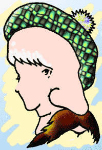
For my Major Project 3, I think I will use my father's business, DRS, which stands for Debt Recovery Solutions. I have been working there this summer and feel that the company's logo could use some help. What I will definitely need in the logo design is an object that stands for what DRS actaully does. I think I will also use some sort of money symbol, probably a standard one and mess with it later on. I want this logo to make DRS stand out and let everyone know what DRS means
Friday, June 30, 2006
Minor Project 10:
For my Major Project 3, I think I will use my father's business, DRS, which stands for Debt Recovery Solutions. I have been working there this summer and feel that the company's logo could use some help. What I will definitely need in the logo design is an object that stands for what DRS actaully does. I think I will also use some sort of money symbol, probably a standard one and mess with it later on. I want this logo to make DRS stand out and let everyone know what DRS means
For my Major Project 3, I think I will use my father's business, DRS, which stands for Debt Recovery Solutions. I have been working there this summer and feel that the company's logo could use some help. What I will definitely need in the logo design is an object that stands for what DRS actaully does. I think I will also use some sort of money symbol, probably a standard one and mess with it later on. I want this logo to make DRS stand out and let everyone know what DRS means
Minor Project 9:
Part 1:
What I found to be very interesting was the fact that some fonts that we use today have been around ever since the 16th century. Some of us today consider these fonts as just certain style to make something look cool, but back then, these fonts meant something. To me, that is fascinating. What I had also found to be interesting, new, and significant all in one was the idea of leading. Up to now, I have not heard of the term leading in designing terms. I have a feeling that leading will become significant in the future during text designing in future projects. The thought that designers can exploit the aspect of letter forming by "carefully manipulating suggestive letter forms so that they become images in their own right" interests me a lot. I love trying to figure out what certain words mean, but at the same time what they are trying to make out as an image.
Part 2:


Monday, June 26, 2006
Major Project 2:

I chose to do a poster design for the movie "The Shining" by Stanley Kubrick. I chose this movie poster because I felt like I had a lot to work with. Being that it is a horror flick, I would be able mess around with dark colors and blending and transforming objects to fit the scene of the picture. The infamous axe scene in the movie will definitely be used in my poster design along with the notorious "REDRUM".
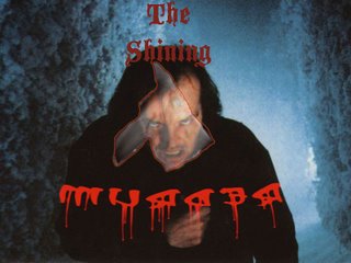
RedRum - http://mercury.walagata.com/w/the-salamander/REDRUM.jpg
Axe - http://surf4you.free.fr/Images/affiches_cin%E9/Shining.jpg
Background - http://blogs.indiewire.com/twhalliii/shining.jpg

I chose to do a poster design for the movie "The Shining" by Stanley Kubrick. I chose this movie poster because I felt like I had a lot to work with. Being that it is a horror flick, I would be able mess around with dark colors and blending and transforming objects to fit the scene of the picture. The infamous axe scene in the movie will definitely be used in my poster design along with the notorious "REDRUM".

RedRum - http://mercury.walagata.com/w/the-salamander/REDRUM.jpg
Axe - http://surf4you.free.fr/Images/affiches_cin%E9/Shining.jpg
Background - http://blogs.indiewire.com/twhalliii/shining.jpg
Thursday, June 22, 2006
Minor Project 6
Part 1:
What I found to be interesting throughout pages 40-77 was that if "there is unevenness in the letter spacing the eye can easily become distracted by the space rather than seeing the shapes." Why I thought this was interesting was because I never really knew that something so minor can create such a distraction to the viewer. What I had found to be significant in my readings was the good point brought across about increasing type size so that it will attract the reader's attention. Obviously the human eye catches the bigger part of the picture first and then is able to see the rest, but I think this statement will become necessary and handy for the future.
Part 2:
Tuesday, June 13, 2006
Minor Project 4:
Part 1:
I have found the final picture to bring the Major Project 1 together. I am going to add Michael Jordan dunking in the air and possibly mess around with the lighting of the picture.
Part 2:
The first thing I found new to my knowledge were the terms hue, tone, and saturation. Until now, I have only heard of those terms maybe once or twice, but by the sound of it, I am going to need to learn them very well and use them alot. What I found to be interesting and new to my knowledge as well was the different meanings of certain colors in different cultures. Until now, I had not known that in China and India, white is the color of death.
Part 3:
Analogous

Advancing
Part 1:
I have found the final picture to bring the Major Project 1 together. I am going to add Michael Jordan dunking in the air and possibly mess around with the lighting of the picture.
Part 2:
The first thing I found new to my knowledge were the terms hue, tone, and saturation. Until now, I have only heard of those terms maybe once or twice, but by the sound of it, I am going to need to learn them very well and use them alot. What I found to be interesting and new to my knowledge as well was the different meanings of certain colors in different cultures. Until now, I had not known that in China and India, white is the color of death.
Part 3:
Analogous

Advancing

Minor Project 3:
Part 1: For my Major Project 1, I have decided to have my theme to be flight. I have chosen flight because there are so many different opportunities to maneuver and create different aspects of flight. I am thinking of using birds or a plane in the distance as my sky or maybe both. Possibly a view of New York City in the distance as well. I haven't decided what else to add, but the last picture will be the thing that brings it together and shows the meaning of the picture, or so I hope. Using different blending tools, along with opacity and resizing, I hope to make the viewer think that the birds and the third picture are coming right at them.
Part 2: What I found interesting and significant about composition is what painter Henri Matisse believed, which was, "....composition is the art of arranging the various elements so as to express feelings in a decorative fashion." Art is all about feelings from how I see it. The colors, objects in the painting or photo, and even size in a sense "speak" to the viewer of the image and tell them what is going on in the image. What I also found that I felt was very important was how we cannot forget that the computer is just another tool and how it cannot do the thinking for you.
Part 3:
http://www.karineriksson.se/press/interior/private-residence-sweden-close-up.htm
This is an example of near/far.
Major Project 1:
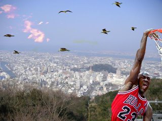
Layers -
Michael Jordan:
http://images.google.com/imgres?imgurl=http://www.district30.k12.il.us/SummerSchool04/sswebclass/jeff/images/dunk_01.jpg&imgrefurl=http://www.district30.k12.il.us/SummerSchool04/sswebclass/jeff/micheal_%2520J.htm&h=432&w=314&sz=59&tbnid=YMhxPMJy1A8EqM:&tbnh=123&tbnw=89&hl=en&start=61&prev=/images%3Fq%3Dbasketball%2Bplayer%2Bdunking%26start%3D60%26svnum%3D10%26hl%3Den%26lr%3D%26sa%3DN
Birds:
http://www.bbc.co.uk/hampshire/content/images/2005/10/03/birds_470x300.jpg
Sky View:
http://www.akg.ee.titech.ac.jp/users/takagawa/tokushima/04.jpg
Sunday, June 11, 2006
Minor Project 2:
During my reading of form and space, I found it interesting that form is considered to be "positive" while space is considered to be "negative". As I read further, I was still stuck on the connections of form and space until I read further into negative and positive space. As I read deeper into unit 2, what I found very interesting was, "Situations can occur when a particular group of forms come together to support each other and compete in such a way that the (normally negative) space is given form by the positive elements. In such cases, our eyes have trouble working out what is form and what is ground. This creates ambiguity, which can be intriguing and stimulate visual excitement." The "Face front" example on pg. 12 shows a vase but also, to some eyes, two people looking at each other. I enjoy trying to figure out pictures like these because they challenge your eyes and make you appreciate what's really inside and around the picture.
During my reading of form and space, I found it interesting that form is considered to be "positive" while space is considered to be "negative". As I read further, I was still stuck on the connections of form and space until I read further into negative and positive space. As I read deeper into unit 2, what I found very interesting was, "Situations can occur when a particular group of forms come together to support each other and compete in such a way that the (normally negative) space is given form by the positive elements. In such cases, our eyes have trouble working out what is form and what is ground. This creates ambiguity, which can be intriguing and stimulate visual excitement." The "Face front" example on pg. 12 shows a vase but also, to some eyes, two people looking at each other. I enjoy trying to figure out pictures like these because they challenge your eyes and make you appreciate what's really inside and around the picture.
Wednesday, June 07, 2006
Minor project 1:
After reading the introduction and the first few pages of Section 1, I now feel even more excited about this class than originally. I am particularly interested in going further in learning about type and the many capabilities it has towards graphic design that I did not know about. What had caught my attention was the idea that graphic design is "a way of seeing that is different from what is just physically there." I want to be able to see and manipulate what cannot actually be seen. Though all this information is somewhat new to me, I hope to learn as well as expand my knowledge on the world of visual and graphical design.
After reading the introduction and the first few pages of Section 1, I now feel even more excited about this class than originally. I am particularly interested in going further in learning about type and the many capabilities it has towards graphic design that I did not know about. What had caught my attention was the idea that graphic design is "a way of seeing that is different from what is just physically there." I want to be able to see and manipulate what cannot actually be seen. Though all this information is somewhat new to me, I hope to learn as well as expand my knowledge on the world of visual and graphical design.
